Developing MAPLE - a keyboard layout optimized for programming
A quick update on my journey towards the perfect keyboard layout for programming


Introduction
Not mine, I just found this picture too relatable
I, too, am a survivor of the mechanical-ergonomic-split-keyboards internet rabbit hole. Actually, I don't think "survivor" is the right word, more like a recovering victim. The many layouts and the amount of thought that went into each one of them inspired me to develop my own layout, which I have since learned and am using right now to write this very blog post 😊
This post is about how I developed MAPLE: the Most Advanced Programming Layout Ever. While the development started as a project to create a universal programming layout for everyone, I realized while working on the layout that there were too many specific decisions made during the development to recommend my layout to other people. I see this post more as an encouragement for people to develop their own keyboard for their needs and use cases - both as inspiration and, in some sense, as a cautionary tale.
What lead me to develop my own layout
Discrimination against the symbols
After reading about all types of keyboards and layouts, I concluded that while maybe the pure "English-optimized" layouts were pretty close to the best they can get, the so-called "programming layouts" were far from perfect.
My main problem with switching to something like Colemak-DH as a programmer was the complete neglect of the special characters, which comprise a significant amount of what we, coders, type. The layouts optimized English letter usage while leaving some of the more common symbols out of the equation and in their horrendous locations just because they weren't regular letters.
The sad, lonely, left thumb

The thumbs are the ones that suffer the hardest from people's laziness and desire to stick to the old but familiar. Their potential is lost not only due to the poor letter and symbol placement on the keyboard but also due to the physical shape of a standard keyboard, which only has one spacebar. Both of the thumbs sitting on the same key is such a waste, they could contribute to our typing much more if each of them would be used to their full potential.
Developing the layout
Background
The key idea of the layout is that letters don't get the special treatment they undeservingly get on most layouts. If some symbol key is more frequent than a letter - It will be in a better location than that letter.
Following the steps of the creators of layouts like RSTHD, Carplax, and Halmak, I decided to make the layout using a simulated annealing algorithm. The idea spoke to me for several reasons:
- It's a pretty neat programming project. And I like neat programming projects.
- It would let me integrate all of my ideas for improving the keyboard - more room for creativity.
- It would let me apply my own algorithm to other languages which lack an optimized layout completely (Hebrew , Toki Pona , lojban...).
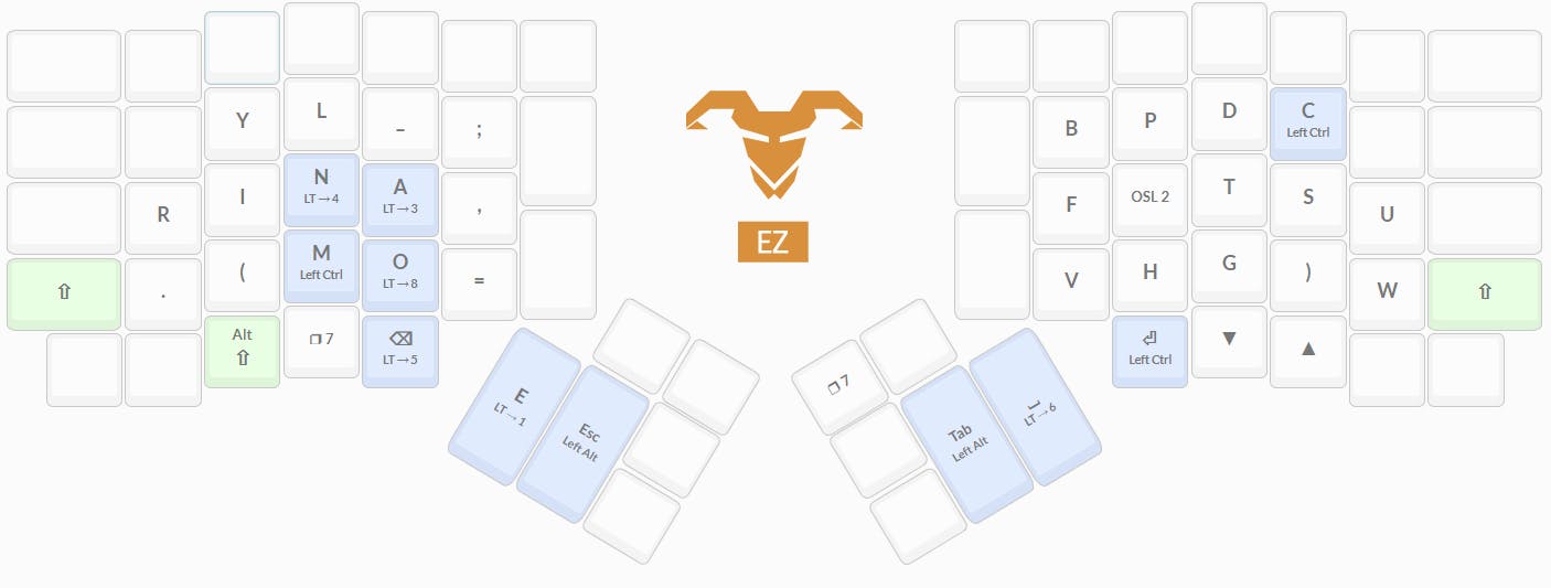
in the spirit of striving for the optimal solution to the layout problem, at least for me, I decided that the layout will take advantage of the features of split ergo boards, like my Ergodox EZ - both their physical construction and the features of firmwares like QMK.
Hands too small...
Another goal I had with this layout is not to use too many keys. Actually, I wanted to use only the closest and easiest-to-reach keys. You might already see where this is going, but there aren't enough keys for every letter and every symbol. This is where layers come into the picture - a very easy way to extend the possibilities of the keyboard (If you aren't familiar with the concept - Here's a guy that used layers to make a layout for just 34 keys, but has full functionality).
The extreme idea that it is better to press two easy keys than one difficult key combined with the realization that I just don't like the upper pinky keys (the ones that have q and p on qwerty), lead me to a decision that might at first glance seem wasteful. I realized that in fact, I don't like those keys just enough to bite the bullet and not include them in the layout. I assure you that we can deal with this little difficulty using layers and, at least for my typing style and hand positioning, it was worth it.
The letter q and its best friend
Ok so this one is just me being super perfectionist for no reason, but in almost all English words, the letter 'q' is followed by the letter 'u', so I decided to add a dedicated 'qu' key, just because why not (don't worry, I added a 'q' key too, for those times where you really just need that one letter alone).
Choosing the keys
As for the thumb keys, I decided that It is pretty logical to leave one thumb for the space bar while using the other thumb for the most frequent letter in English - E, just like the Maltron layout. As Xahlee puts it:
... the Maltron layout is significantly better, simply because it added a home key (the thumb key), and moved a significant load to the strongest finger.
So, with the E key fixed to the left thumb, I wanted to see which keys get to sit on the main layer, and which ones will require two key presses. The corpus I used for those measurements is described later in the post.
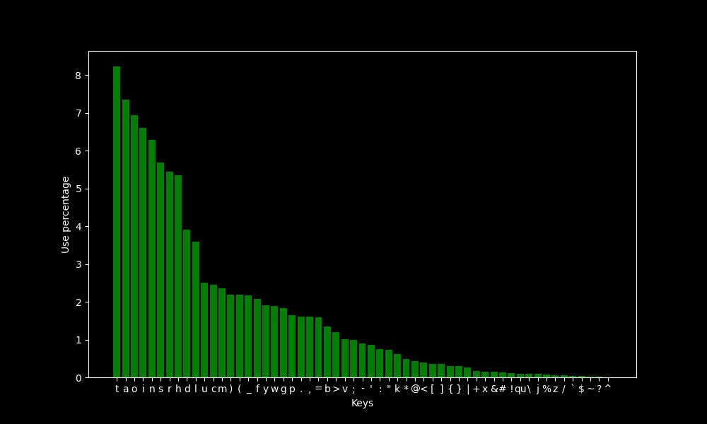
The only exception I've made is putting the > key, which was about as frequent as the letter B, in the secondary layer for aesthetic reasons, and for making the common - > bigram an inward roll. That allows me to have < - > on the home row in the secondary layer.
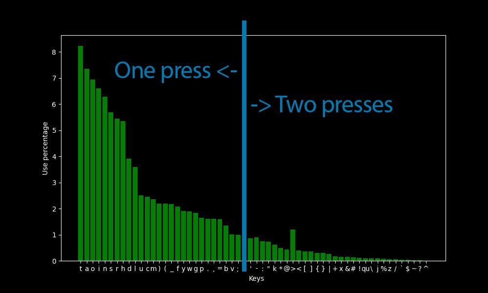
After combining all the keys below the threshold into a single 'secondary' key, which is the layer transfer key to the secondary layer, here are the combined key results:
"secondary": 9.223318515305937,
"t": 8.231233510426831,
"a": 7.345766019733275,
"o": 6.946402110665365,
"i": 6.612092956015758,
"n": 6.286819183924247,
"s": 5.681448552531714,
"r": 5.444721529509559,
"h": 5.354367703928584,
"d": 3.906899418121363,
"l": 3.5996964111460477,
"u": 2.5046080451046295,
"c": 2.4503957497560447,
"m": 2.3600419241750696,
")": 2.1955979616176946,
"(": 2.1901767320828363,
"_": 2.172105966966641,
"f": 2.0799450648740465,
"y": 1.908272796270194,
"w": 1.8902020311539989,
"g": 1.8359897358054138,
"p": 1.6462467020853662,
".": 1.6101051718529762,
",": 1.6028768658064982,
"=": 1.5866131772019227,
"b": 1.346272001156529,
"v": 1.0029274639488235,
";": 0.9848566988326285
The symbols which did not make it into the main layer were either placed in the secondary layer or on the shifted layer (the one which is activated when shift is pressed).
While the secondary layer was constructed manually, consulting the frequencies of different characters and bigrams, the main layer is far too complex to construct without the help of an optimization algorithm. This brings us to the algorithm that chose the positioning of the keys on the main layer and the criteria it used to judge layouts.
The algorithm
I used a simulated annealing algorithm to create the layout. The algorithm uses a scoring function that gives a score to every layout it gets, and the optimization algorithm tries to minimize the result of this function.
After playing around with different functions and parameters I settled on the following two criteria:
1. Single-key effort map
I've created an effort map that maps an 'effort' score to each position on the keyboard. This effort map was then used, in conjunction with the keyboard-usage data (which will be described later) to give a single-key effort score to each layout: Each key's effort was multiplied by the usage statistic of that key on each layout, and all those numbers were then summed up to create the total score. The lower the score, the less reaching for far away keys there is while typing on the layout!
2. Bigram effort map
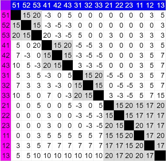 (Each number XY represents the key at column X on row Y. Each cell represents the bigram that starts with the pink key and ends with the blue key.)
Single-key effort cannot be the only parameter, and there are two reasons for that:
- If single-key effort was enough, there wouldn't be a need for a machine-learning algorithm to optimize for it...
- Same-finger bigrams (SFBs) and so-called 'rolls'.
SFBs are two consecutive key-presses made with the same finger (which are uncomfortable and should be punished) and a 'roll' is a series of key-presses that are typed with a single fluid motion of the fingers, either inwards or outwards. Those are considered comfortable to type and a layout that encourages them should be rewarded.
To add this consideration to the algorithm, I have created a table that gives each bigram a score - a negative score means the layout is rewarded for using the bigram, while a positive score punishes it. This table was by no means made to universally represent the typing of the general public, just what I felt was right for me.
The corpus
A very important part of the optimization process is what text the algorithm uses to optimize. As befits a programming layout, the training data was code. I used a 3000-line, roughly equal mix of Python, Haskell, and C code, just because those are the languages I use.
I also did not want some frequent variable names or keywords in the code to impact letter frequencies, so I replaced the letter frequencies with ETAOIN (the commonly-used letter frequency figure), taking only the symbol frequencies from the code.
Of course, anyone creating his own layout should create a corpus representing his own use of the keyboard.
The result
After playing with the parameters for the algorithm a lot, I proceeded to a more granular tweaking process, which was comprised mainly of tweaking a single parameter, generating layouts, and doing some imaginary typing on them.
I also made a 'polish' function which made sure that the layout I've created is really the local minimum and there's no single swap of two keys that can make the layout better.
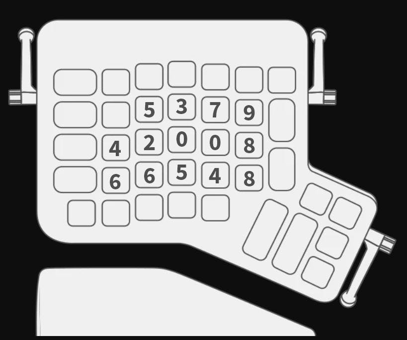
So, without further ado, I'd like to present to you: MAPLE
It's important to note that the main (base) layer is the only one that was generated with the algorithm, and the secondary layer was assembled manually. Not only that but this layer evolved throughout my usage of the layout and has been patched so many times that it may look a little weird. If I was to remake this layer from zero, it would be much better, but I'm too used to the good ol' patched version that a reimagining of the secondary layer will probably come only if and when I decide to make a new layout (more about that later).
Some good stats and what I've done right
I ran a close approximation of my layout through stevep's fork of patorjk's layout analyzer (it does not really support layers, so I used 'Alt Gr' instead), and the results were pretty nice.
I picked some other layouts to compete with - the ones that interested me the most and QWERTY for reference. The QWERTY and the Colemak-DH are thumb-shifted (the shift key is under the thumb, just like on MAPLE).
Even when it comes to regular text, and not code, MAPLE is on par with layouts like colemak, like this test on the first chapter of 1984:
and this test on the first chapter of Alice in Wonderland:
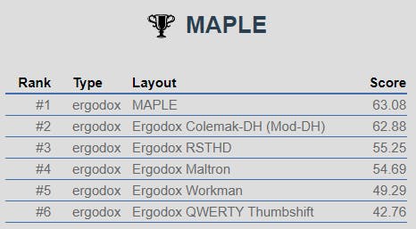
To be honest, I was pretty surprised when seeing those results. After all, I set out to optimize the layout for programming, not for regular English text. To really check what's going on, while eliminating all other factors that could skew the results, I took a list of the 3000 most used English words, lowercase only, and compared the layouts:
 Well, how about that?
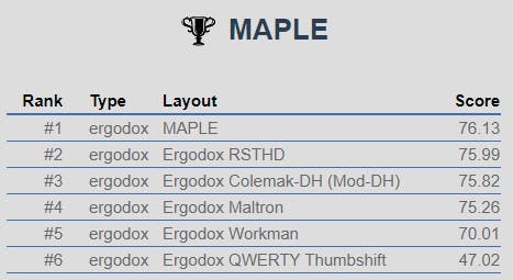
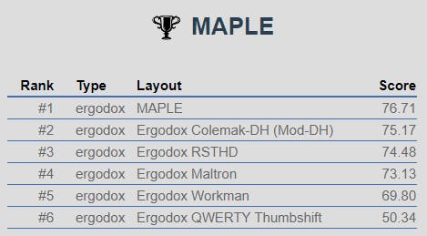
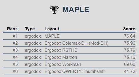
But where MAPLE really shines through is in the programming simulations, like this one where the layouts are competing on the built-in Ada game-of-life code:

and this test on the corpus I used to train the layout:
Note that the very clear advantages of MAPLE on symbol-heavy text in this analyzer come mainly from the positioning of the symbols on the competing layouts - they all place the symbols in their default, mainly number-row positions. This is indeed the main goal of the layout, though it's hard to call those figures a fair fight.
Another factor that increases MAPLE's score is the convenient placement of the modifiers (one on the home row, and the other under the thumb). If you look at finger usage in the different layouts, you can see the one thing that let the other layouts down is the pinky usage for the shift key:
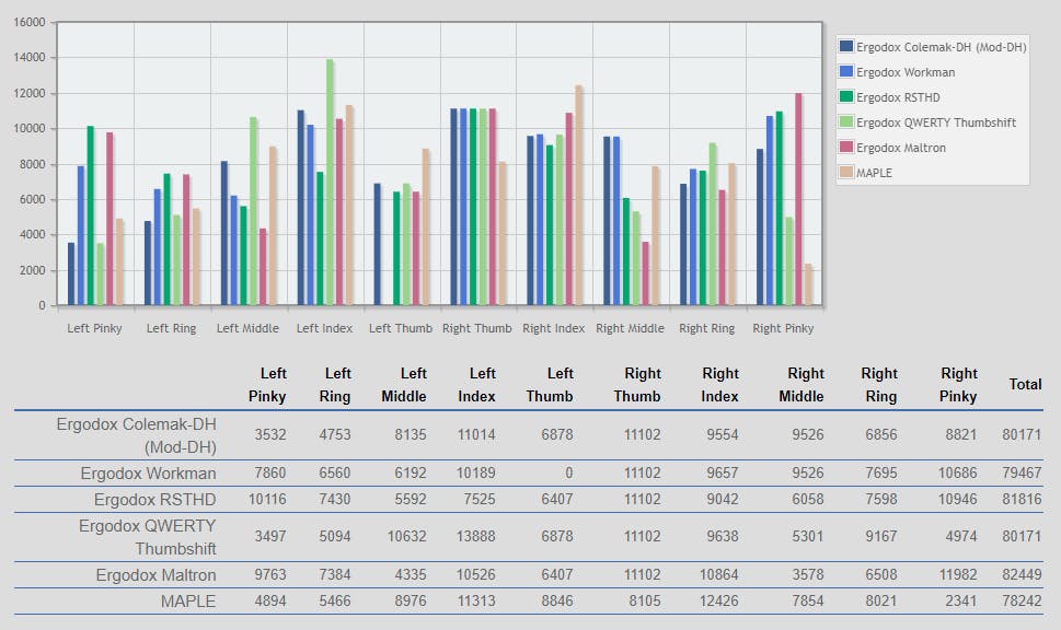
Overall, the finger usage on MAPLE seems to be logical, with the most used fingers being the indexes and the least used being the pinkies.
The heatmap of the keyboard is exactly what I expected: The layer-switch key has about the same usage as the other home-row keys, and the layout looks fairly balanced.
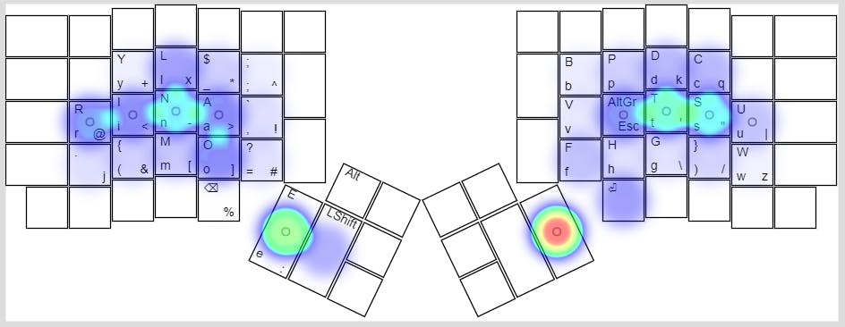
(This heatmap uses the code that I used to train the layout as input, with a slight modification: I have removed the spaces preceding every line so that it presents a more realistic picture of how we type and the heatmap is not dominated by the space key)
Some not-so-good stats and what I've done wrong
After using the layout for a few weeks, I noticed that long sequences of letters that are typed with one hand are more frequent than I would like. It is not a very major issue, but still, I think it would be a good idea to punish such sequences in the algorithm.
Another thing that I would do differently is to give the construction of the secondary layer more thought. I originally did not account for inter-layer bigrams and found myself modifying the layout many times, even to the point where there are now two apostrophe keys on the layer, for different usage cases...
MAPLE 2.0?
There are some possible improvements to the original MAPLE, in addition to some new ideas that I thought might be worth trying:
- Punish layouts for having too many letters on the same hand in conjunction.
- Use two layer-switch keys, one on each hand - this will allow more hand alternation while typing.
- Give symbol-letter bigrams a higher weight (For example 'r.' is much more frequent than 'u.', and still the algorithm preferred the former as an SFB).
- Give more thought to the secondary layer, maybe even apply simulated annealing to this layer too.
Still, I don't think that in the close future I will want to relearn typing again, so those ideas are left to future me, or someone on the internet who is as bored as I was when deciding to start this project 🤷♂️
Concluding thoughts
I am, in general, very satisfied with this project. I enjoy typing on a keyboard layout that I have built myself and improving it bit-by-bit. I hope that this post will give some of you people some new ideas to think about, and maybe get some constructive criticism on the way.
I would also like to thank all people mentioned in this post: xahlee, xsznix, patrojk, stevep and many others for the wonderful resources they post on the internet, and also DreymaR, Semi and other people who've given me feedback while developing the layout on reddit and on discord.
Feel free to contact me on Reddit (u/McSeemG) or anywhere else for any questions or suggestions 😊
peace ✌